System Thinking
Color tokens, typography rules, and button variants now read like a real design system instead of buried theme code.

The original project became a sandbox for visual language, motion, and interaction ideas. Instead of presenting that work as a pile of templates, this version breaks it into a cleaner portfolio narrative.

Color tokens, typography rules, and button variants now read like a real design system instead of buried theme code.
The button and typography customizers stay front and center as proof of process, not just implementation.
Brand moments like banners, content blocks, CTAs, and list patterns are grouped into reusable sections for a portfolio walkthrough.
Color tokens, typography rules, and button variants are surfaced here as a working system instead of staying buried inside theme code.
Palette groups are generated from the original CSS custom properties.
Montserrat-led hierarchy with bold editorial headings and readable body sizes.
Paragraph One carries the most expressive supporting voice.
Paragraph Two is tuned for long-form explanation and interface clarity.
Paragraph Three works for compact UI copy, labels, and supporting metadata.
Label / 14px
Legal / 10px
Primary and secondary button families with size and color variants.
Brand moments like banners, content blocks, CTAs, and list patterns are pulled out of the site and reframed as reusable sections.

These patterns were pulled from the client technology and content pages to show how the system scales.
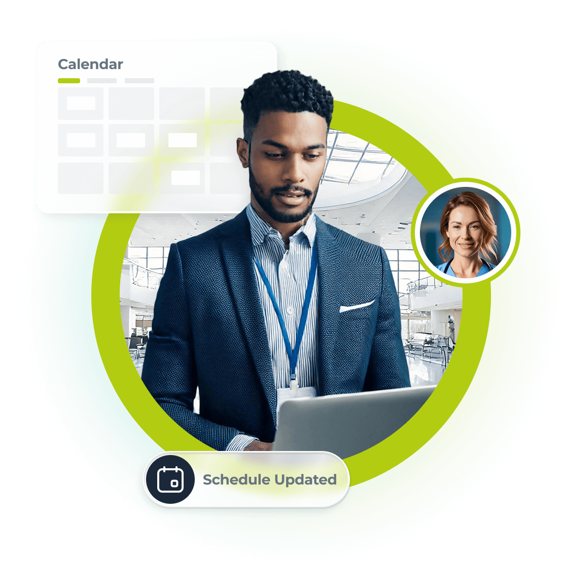
A product story centered on talent management workflows, dashboards, and clinician visibility.
See the System in Action
A self-service staffing platform story expressed through layout, icons, and modular CTA patterns.
Open PlaygroundsA standout pattern from the build: stat-driven tiles with a cursor-aware bubble effect and animated metrics.
The original build invested in form feel and clarity. This section pulls those ideas into a reusable specimen.
Text fields, selects, textarea, consent, and segmented checkbox pills.
These tools keep the button and typography customizers front and center as proof of process, not just implementation.
A mini editorial canvas for testing hierarchy, emphasis, and alignment more like a document editor than a form.